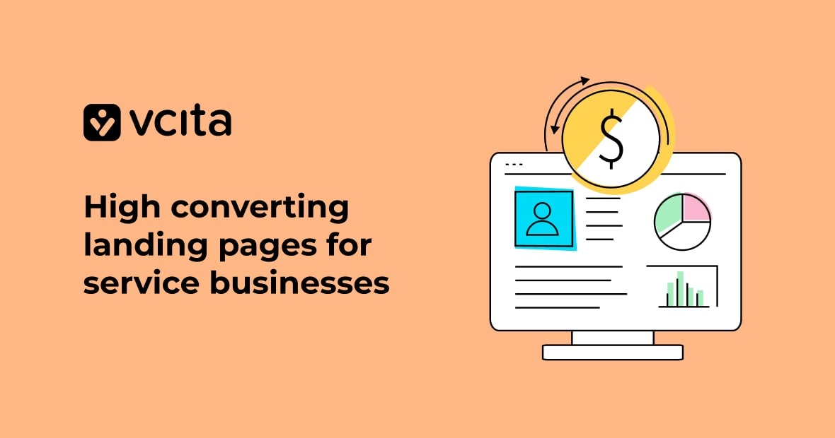
The more navigation it takes to find your promotional offer, the less likely your clients will be to take you up on it. No matter how engaging your online ads are, they’re useless if they lead to a web page that’s confusing, complex, or has no relationship to the ad copy. If you’re a service-based business, don’t fall into the habit of using your contact information as your website marketing strategy! Using good landing pages for the right campaigns will help you convert more leads and launch new services. Below are some examples of good landing pages for service businesses, but first, here’s a rundown on how they work:
What’s a landing page?
When you click on an online ad, you’ll often find yourself on a web page that sells exactly what you saw in the ad copy instead of the business homepage. These are landing pages—powerful marketing tools that direct a client’s journey to a specific product or service. They’re often simple, with clear copy and intuitive navigation. A landing page can technically be your homepage, but most often when marketers refer to landing pages, they’re referring to pages designed for a specific sales or lead generation goal. Landing pages can either be internal to your website or a separate page altogether.
The number one reason that landing pages are so ubiquitous is that they work—they offer higher conversion rates than home pages do, and easier ways to quantify conversion data. With landing pages, you can test exactly what aspects of your marketing strategy work best with A/B testing: creating two slightly different landing pages to see which strategy converts more visitors into leads.
Landing page traffic—who might stop by?
Often people associate landing pages with paid ads, but not all landing pages are made as a destination for paid traffic. Other types of traffic you might direct to landing pages are:
- Organic traffic: When someone clicks on your website because you showed up naturally in your search results, they’re part of your organic traffic. Use SEO tools to help your internal pages match keywords, so your organic traffic clicks on the landing pages that suit their needs.
- Referral traffic: Referral traffic comes from clients that click on links in other websites that direct them to your site. Guest blogging, commenting, and creating great content are all ways to increase your referral traffic. If you use these strategies, you should also consider creating customized landing pages for different types of offsite content, especially if different sites are likely to attract a different customer demographic.
- Social traffic: If generating traffic to your homepage through social media is Marketing 101, then generating traffic from social media to specific landing pages is Marketing 201. Social media gives you unique opportunities to target specific audiences, such as Facebook groups. Don’t waste the opportunity by sending them to your homepage! Instead, make a landing page tailored to the demographic you’re targeting or the post you’ve made.
- Direct traffic: The people that click on your website through email marketing campaigns or direct mail are direct marketing traffic. If you have a CRM system, you can organize leads by type and direct them to different landing pages depending on their needs. This works with email, but it also works with flyers too. Even though some might claim the QR code is dead, the truth is that they are still effective for direct mail and on business cards, especially if you have great landing pages to match them.
How to design a good landing page
A lot of the success of your landing page will depend on its design. Great landing pages are simple, direct the viewer towards a single action, and are visually arresting. Taking some time to getting to know the principles of good user experience design (also referred to as UX design) is a good idea before you jump into building your first landing page. But if you don’t have time, here are the main things you should know:
Make it simple
If there’s one golden rule when designing a landing page, it’s simplicity. Simple copy, simple design, and a limited number of possible actions. Whether you’re requiring your user to click on a button or fill out a form, the action should be obvious from both the copy and the layout of the page. Although some landing page designers swear by a 1:1 attention ratio (the ratio of possible actions on the page to actions you want a user to take), the number of links will depend on the type of landing page you’re going for.
Mind the fold
Although most people today tend to scroll down through webpages, recent research suggests that what appears first in a browser still gets the most attention. Information that appears below the fold, or the bottom of a visible web page before scrolling, gets less attention—so make sure your most important information is at the top. Encourage users to scroll down if they need to by avoiding false floors, or design that gives the illusion that the information on the screen is all there is.
Choose the right call to action
A call to action (CTA) is a short phrase or button that tells your user what they should do. But really good CTAs are persuasive as well—they tell the user why they should do it. For example, if you’re demonstrating a service, you might have a button that tells your user to “Schedule a Demo.” But if it’s free, why not include that in the button itself? “Schedule Your Free Demo” tells the user it’s free and implies that it’s already theirs. Here are a few general categories of CTA buttons, and when you might use them:
- “Book an appointment”: Hair dressers, life coaches, and other sevice providers who rely on their clients to book a first appointment might have a CTA button like this on their website. You could also try “Book now,” or “Book your appointment today!”
- “Contact me”: A more informal CTA button might read, “Let’s chat.” Buttons like this are useful for service types that need to collect information about a client in order to determine how they can help, like a physiotherapist, psychotherapist, or chiropractor.
- “Learn more”: This might be useful if you’re offering an ebook, email newsletter, or some other informative content that you require people to sign up for. You might decide to replace this with a more specific CTA, like “Sign up for our newsletter,” or “Download your free ebook.”
Remember, it’s okay to get creative. For example, a hair salon promoting a conditioning treatment might have a CTA that reads, “Repair Your Hair.” You can amp up your CTA buttons by placing them next to copy or images that answer the “why” question as well.
Cut your copy
When you’re excited about your service, you want the world to know all about it. But it’s a good idea to keep in mind that others will need some convincing. Most people tend to skim through sites, looking for headlines—so make your copy stand out visually by separating it with plenty of white space.
Make it accessible
Make sure everyone can digest the information on your page, including people that are colorblind, visually impaired, or hearing impaired. If you have a video on your page, add captions or a transcript of the video as an option. Good alt text for images helps visually impaired people understand what the image is trying to communicate. Fonts should be clear, with enough contrast to make them legible even on small devices.
Balance contrast and unity
While it’s true that great design needs contrast to work, too much contrast can make your design confusing. Achieving a stellar design is all about balancing contrast and unity so that the elements that are important can stand out. For example, you might choose a monochromatic design that acheives contrast through alternating forms or fonts instead.
Create a visual hierarchy
How you balance contrast and unity is equally as important as doing it in the first place. Visitors to your page won’t automatically know what information is the most important—so to guide them, make the most important information stand out as much as possible. There are several ways to do this, such as making the most important text the largest, or leaving a lot of white space around your call to action button.
Images add meaning
Since the copy on a landing page needs to be short, images are an excellent opportunity to give your user extra information without needing to explain it. You can use images that interact with your text, or grid that creates a narrative as a background for your product. However you use images, remember to optimize them for the web so your page loads quickly. Run a quick checkup via the website auditing tool to see if your files (images, CSS, and Javascript) need to be optimized and if any technical issues prevent your landing page from gaining traffic.
5 types of landing pages for service-based businesses, with 10 great examples
Service-based businesses have a unique challenge: products are easier to capture with a simple image, while services often need an explanation. Since landing pages should ideally focus a viewer’s interest in the first few seconds, that explanation needs to be as concise as possible. The five landing page examples for service businesses below each address this specific challenge in unique ways.
#1 Type – Online booking landing page
This type of landing page is great for clients who you’ve already built some level of trust with, either through social media campaigns or email marketing; however, trust can also be established with longer landing pages as well. They lead customers towards a scheduling CTA, which ideally allow them to book your services online. Both of the following examples were created with vcita’s scheduling app, which offers unique scheduling CTA apps that remain stationary as the user scrolls, and opportunities for clients to book through the website.
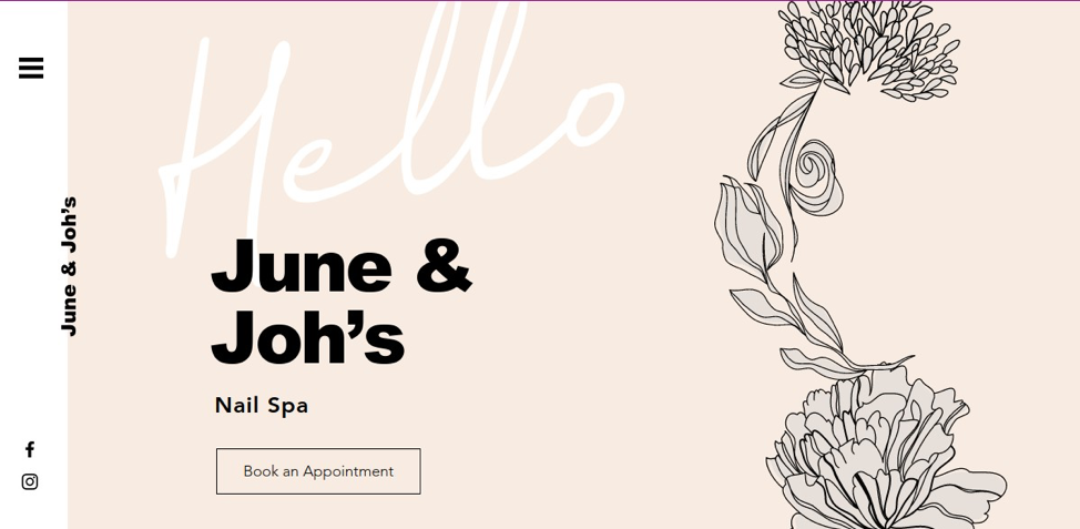
- June and Joh’s June & Joh’s minimalist approach is a fantastic example of the way white space can be used to highlight a call to action. The “Book an Appointment” button stands separated from the greeting, title text, and background image. As the user scrolls, the quick introduction of three treatment options and their price points is underscored by a standalone black “Book Now” button, offering a slightly different variation on the previous call to action. The illustrations and colors unify the brand as the user scrolls further through an introduction, testimonials, and a contact page that allows them the alternate option of sending a message.
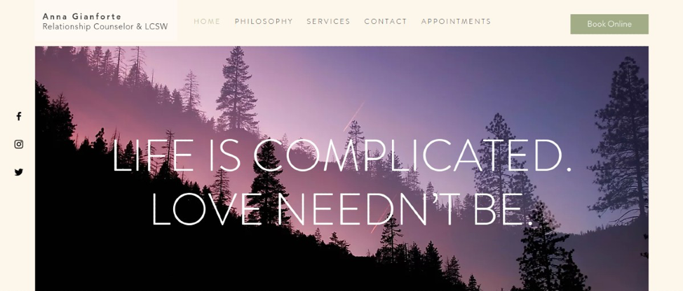
- Anna Gianforte Anna Gianforte’s page is a beautiful parallax design that uses a stationary “Schedule Now” button. It remains in place as the user scrolls through the description of her philosophy, services, and contact information, highlighting it against each text and image background. This allows the “why” that underscores the CTA to be more varied and complex, as the CTA is juxtaposed against different information. The website uses an analogous blue-violet color scheme to create brand unity, broken by the green contact information band.
[button link=”https://www.vcita.com/signup” type=”big” color=”green” text-color=”black”;] Create your own landing page with vcita[/button]
#2 Type – Lead generation pages
Sometimes also known as “squeeze” pages, these landing pages are designed to collect user information (usually names and email addresses) for marketing purposes. Since most people will be reluctant to hand over their email address, these pages usually offer something in return, whether it’s an ebook, newsletter, or something else that users might find enticing. Service businesses that use email marketing can use these types of lead pages to help build their marketing list, as long as they make the opt-in clear.
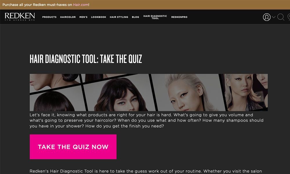
- Redken Although it’s not a service-based page, this one has a unique clickthrough approach that could be modified for just about any business. When the user clicks on the large, pink “Take The Quiz Now” button, they’re presented with a series of questions asking them to describe their hair. At the end of the quiz, the page recommends a product, and a pop-up appears inviting the person to create an account so they can save their results. This is a great tool that could be modified to determine what type of haircut or other service someone might need.
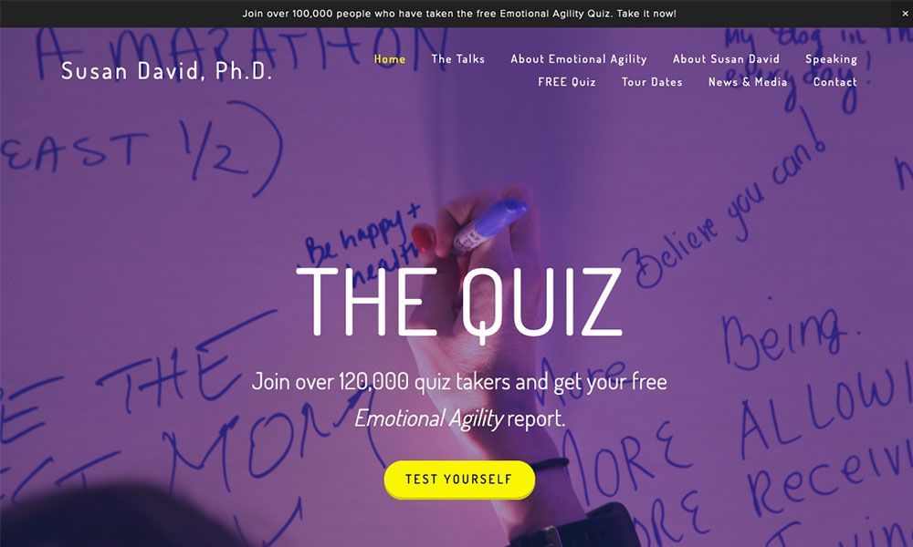
- Susan David Susan David’s page is another great example of a lead generation page. After clicking on the bright yellow “Test Yourself” button (which stands out starkly against its complementary purple background), users are directed to a different quiz page. The page offers to send the results via email, collecting the contact information of users who might be interested in her content. At the bottom of the page, there’s an alternate option to enter their first name and email address for a chapter of her book and a subscription to her newsletter.
#3 Type – Longform landing pages
Longform landing pages are an excellent option for service-based businesses whose client acquisition strategy is based on trust in their service. Unlike most other landing pages, longform pages give the user a lot of information—but they still do so in a balanced way. The key to creating a great long form landing page is to structure it well, starting with a simple CTA and moving through more complex information from there. A longform page is for brands that need to tell their story in order to convert leads.
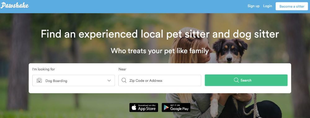
- Pawshake Pawshake’s landing page invites the user to “find a local pet sitter who treats your pet like family,” with an option to search. Since their copy makes a trust-based claim, they back it up with a lot of information below. The “How does it work” section offers a step-by-step explanation with short, brief snippets of text separated by images in their brand colour. Testimonials, blog information, and a FAQ section follow, each balanced by plenty of white space to break up the text.
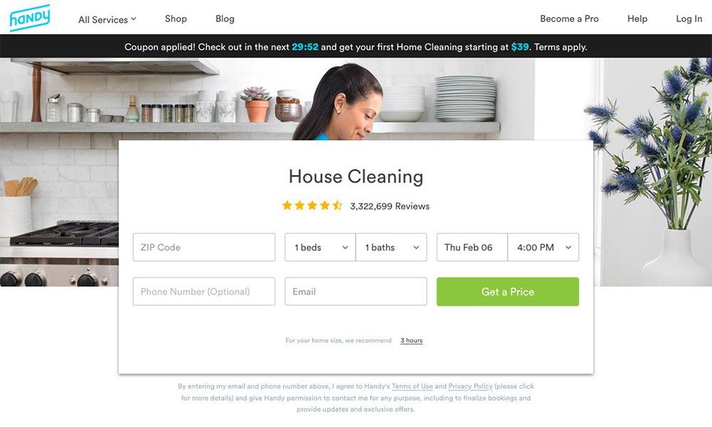
- Handy Handy, a cleaning and handyman service, opens to a quote finder and a “Get a Price” CTA button. The site creates tension between its length and the 30 minute countdown timer at the top that creates urgency. The picture of a clean, white room directly behind the CTA juxtaposes the sparse CTA text with an image that says what the text leaves out. Their review results and number of reviews is also featured in the white space between the title and web form, inviting the reader to trust the reviews of others without explicitly saying so—but those that need convincing can read down through an elaborate explanation of their services.
#4 Type – Event landing pages
While the examples given aren’t directly from service based businesses, promotional events can be used to create awareness about services. For example, a hair salon might create a holiday event to promote hair and makeup, or a life coach might want to advertise a speaking engagement. Event landing pages emphasize the details of the event, including things like countdowns, calendars, and maps, and usually a registration or ticket-purchasing CTA.
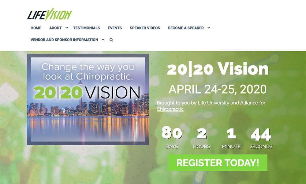
- Life Vision Seminars Life Vision seminars for chiropractic professionals has a landing page with a timer placed directly above the large CTA button, emphasizing the urgency of registering. Other events are just below, with four options to learn about presenters, locations, and social functions. These details are separated by a cool grey band, but unified to the rest of the brand with the same bright green rollover highlight that appears on the rest of the titles. Links to event details are a prominent feature of the design.
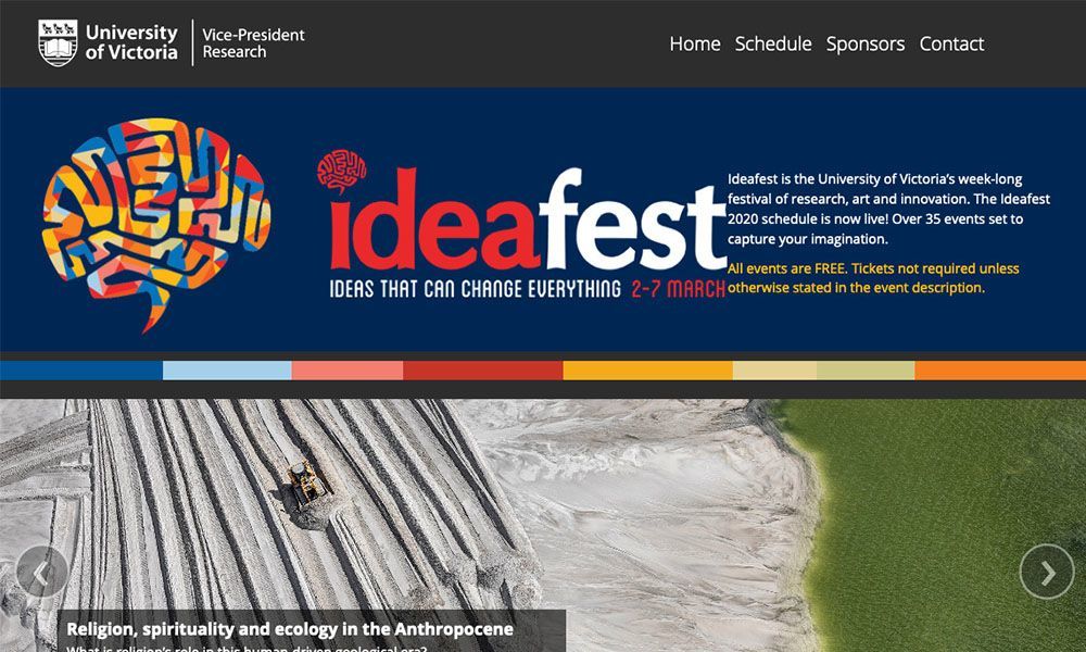
- Ideafest Ideafest is a free event, but this type of landing page could easily be modified to include a “Purchase Tickets” or “Register Now” CTA at the top. Instead, the site features a short description above a scrolling slideshow of images representing the topics covered, saving scrolling space. The “Schedule” feature also gives users the chance to click through the event schedule without scrolling further down for each day, thereby reducing the amount of text on the page at any given time, making the page less overwhelming. The background of the “Sponsors” and “Contact” sections retain brand uniformity by using colors that appear in the fonts at the top.
#5 Type – Special offer landing pages
Without landing pages, special offers might get lost in the shuffle—ads that feature discounts on products or special coupons for referrals are best served if they take customers directly to landing pages that feature the particular offer they mention. Whether it’s a discount on a treatment session or a referral offer, landing pages help convert the customers that are specifically looking for the deal stated in your ad.
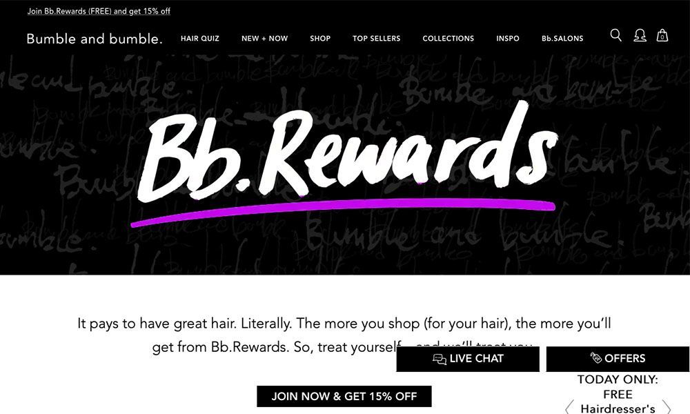
- BB Rewards Bumble and Bumble Salon’s rewards landing page features static “live chat” and “offers” buttons that stay put as the user scrolls. Instead of a bunch of text, the page explains the advantage of each level of rewards tier with an easy-to-read chart. The “Join Now & Get 15% Off” appears twice, both at the beginning and end of the chart, offering users a second chance to take the offer when they scroll to the bottom.
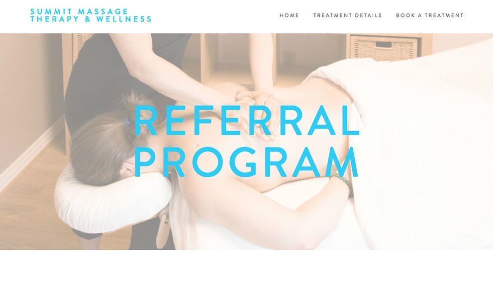
- Summit Massage Referral The Summit Massage landing page is optimized for phone screens, since it’s the destination page for a QR code. QR codes aren’t without their problems, but they can be a great addition to flyers as long as they have an appropriate landing page to back them up! Here, the landing page explains what to do with the card that the QR code appears on. It’s a smart way to market to clients if part of your marketing strategy relies on direct mail.
Good landing pages: a win-win
All good customer journeys need a destination. Landing pages help them get there as quickly as possible, and help you convert more of your online traffic. Landing page builders like vcita’s can help make the design process as painless as possible, so you can make as many of them as your business needs.